Personal Branding Redesign
My redesigned personal branding, focusing on bold typography and neo-brutalist aesthetics.
I recently relaunched my personal branding and portfolio website, this project was born from a desire to finally consolidate all my work alongside a growing feeling of disappointment with my prior branding. I grew tired of my previous black and white “Uber-esque” look, what previously felt professional and modern to me now looked sterile and generic.
I wanted to approach my new branding from a different philosophy than my prior attempts. It would not only look professional but also highlight my personality and aesthetic preferences. I wanted it to be a launchpad for me to experiment with all of these visual ideas I’ve been constantly inspired by: Barbra Kruger-esque bold typography, Neo-brutalist aesthetics, and type as texture. It was a tall order, but here’s the end result:
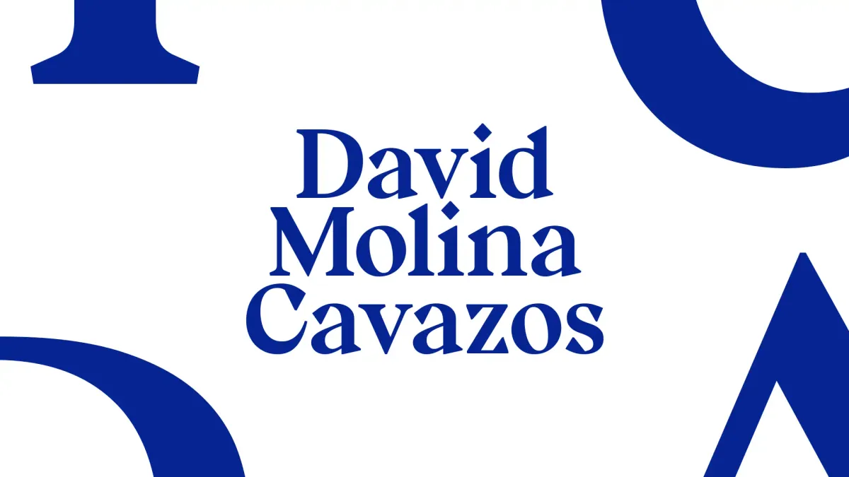
Typography
Type is the beating heart of my new branding. Individual characters in the typefaces are expanded and distorted to create textures that frame my projects, which are then labeled using those same typefaces. As a result, the font choices would be essential to establishing the correct tone and aesthetic. I decided on half of the equation long ago, I’ve always had a soft spot for utilitarian “boring” fonts like Helvetica (nerds would call them neo-grotesque). My previous branding taught me that just a Helvetica-alike is a little too beige, even for me, so I added a funky eye-catching font for the headings that would add spice and texture.
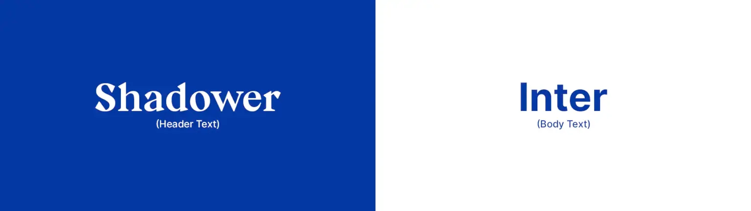
After a lot of trial and error I decided on Shadower and Inter as my two fonts of choice, both free and open-source.
Colors
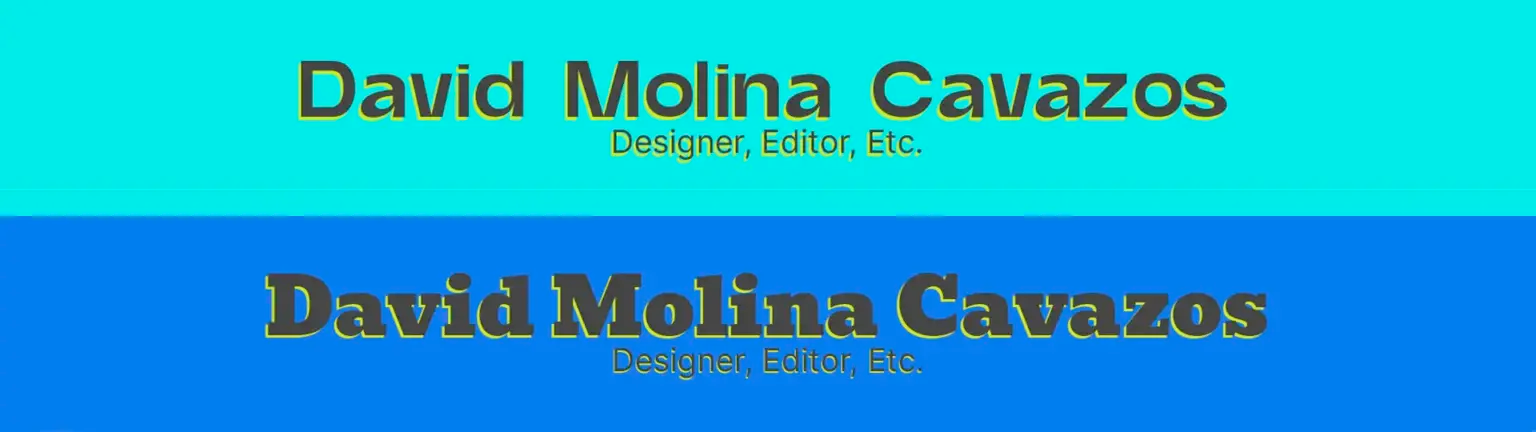
The most difficult aspect of this project by far was creating a color palette. Most of the Neo-brutalist designs I saw were either an explosion of color that contained every shade under the sun or limited themselves to two. My first attempt was to split the difference and try and focus on a pop art-esque red/blue color combo:
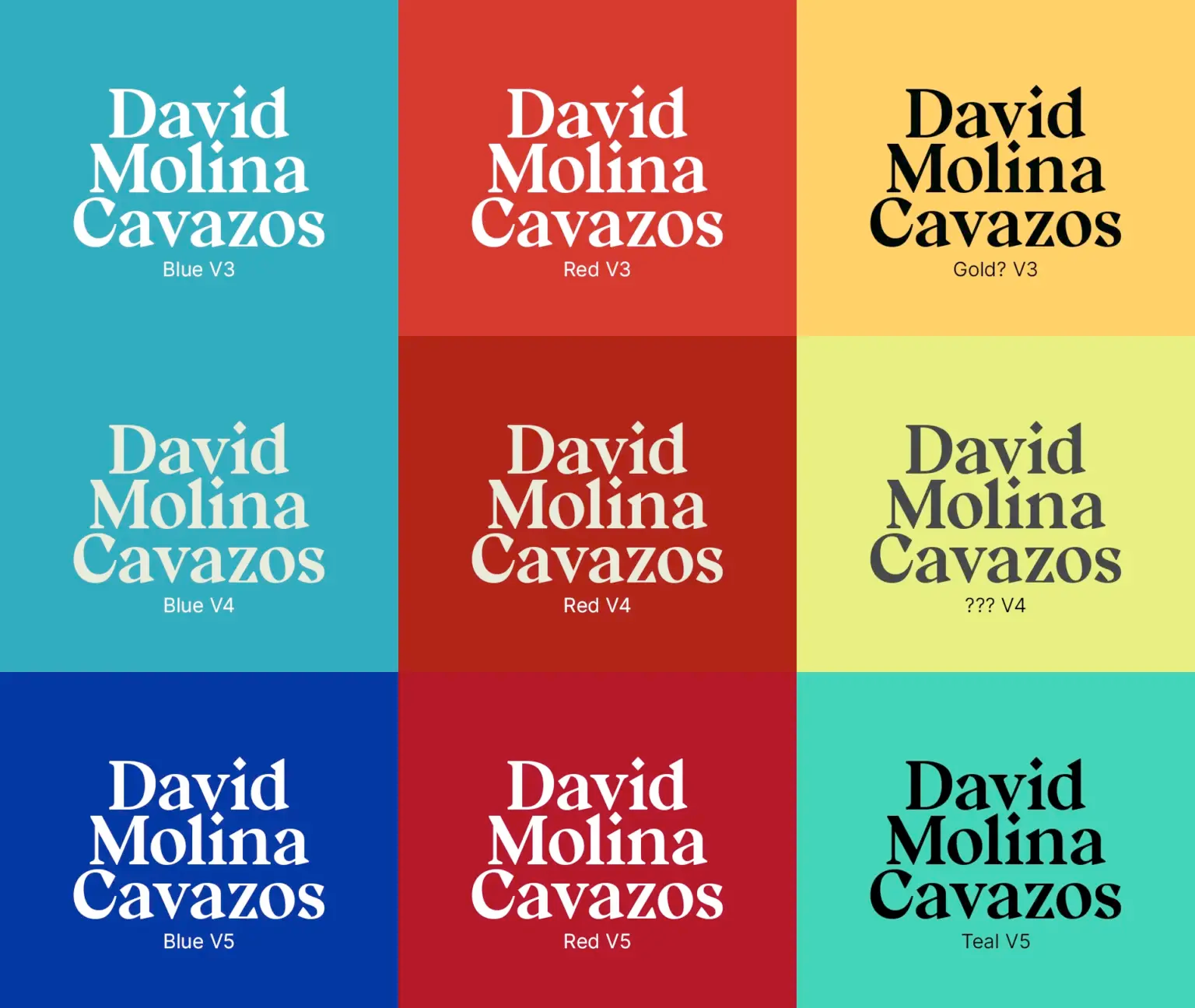
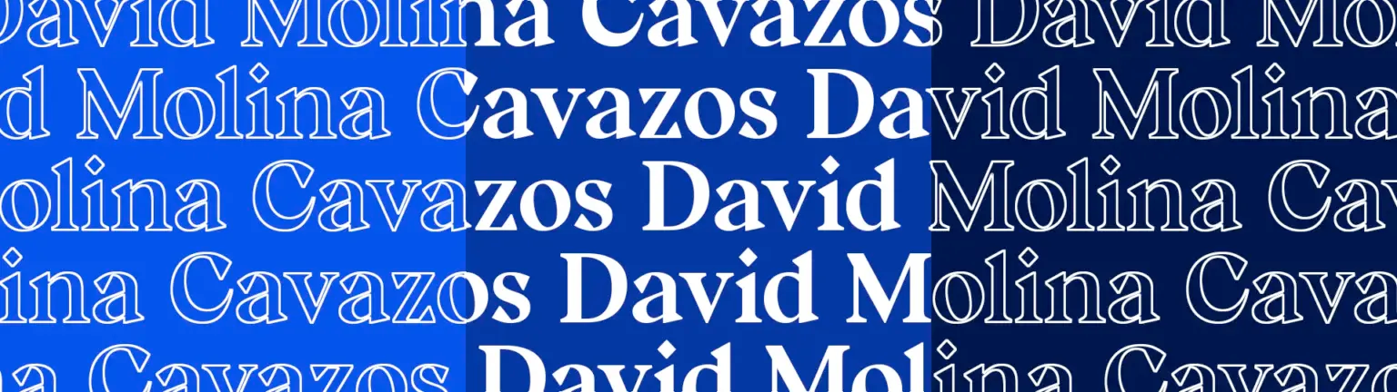
The palette above is what I originally “launched with” but none of the other colors really meshed well with the design of the portfolio website I was creating. I was really only using the blue, so I pivoted towards only using the blue with darker and brighter variants for animation highlights and experiment with creating sections of content within the website.
The Future
This branding is a series of purposefully simple fundamentals that are intended to be iterated on, remixed, and challenged as I experiment with different aesthetics and design trends. It’s a series of choices intended to ground and unify all my future explorations – a playground, not a prison.