The Great Website Post-Mortem
What's a little self-indulgence between a boy and his blog? Let's go through all of my old website and see how far I've come (and fallen).
Alright, I’ll admit it, seeing the old Tumblr portfolio on the first post made me just a little nostalgic. So I thought, what the hell – what’s a little self-indulgence between a boy and his blog? Since I have web design on the brain, let’s go through all the previous incarnations of my portfolio website and see how far I’ve come — or fallen in some cases.
Before diving into the 5 main websites (named v1 to v5), I’d be remiss if I didn’t mention all the tiny websites that predated them. There was a fair amount of half-setup and abandoned WordPress and Blogger blogs, along with a very sketchy, poorly modified vBulletin forum. The latter was a result of a desire to have the same exact setup as my favorite YouTubers, Hat Films, were using at the time. It didn’t matter that my forum would be a ghost town considering I had all of 20 viewers from the Minecraft forums, I needed to have the same tech as them. My “keeping up with the joneses” feelings changed when I discovered this sweet program that came bundled with the Creative Suite.
v1 – Adobe Muse (Early High School)
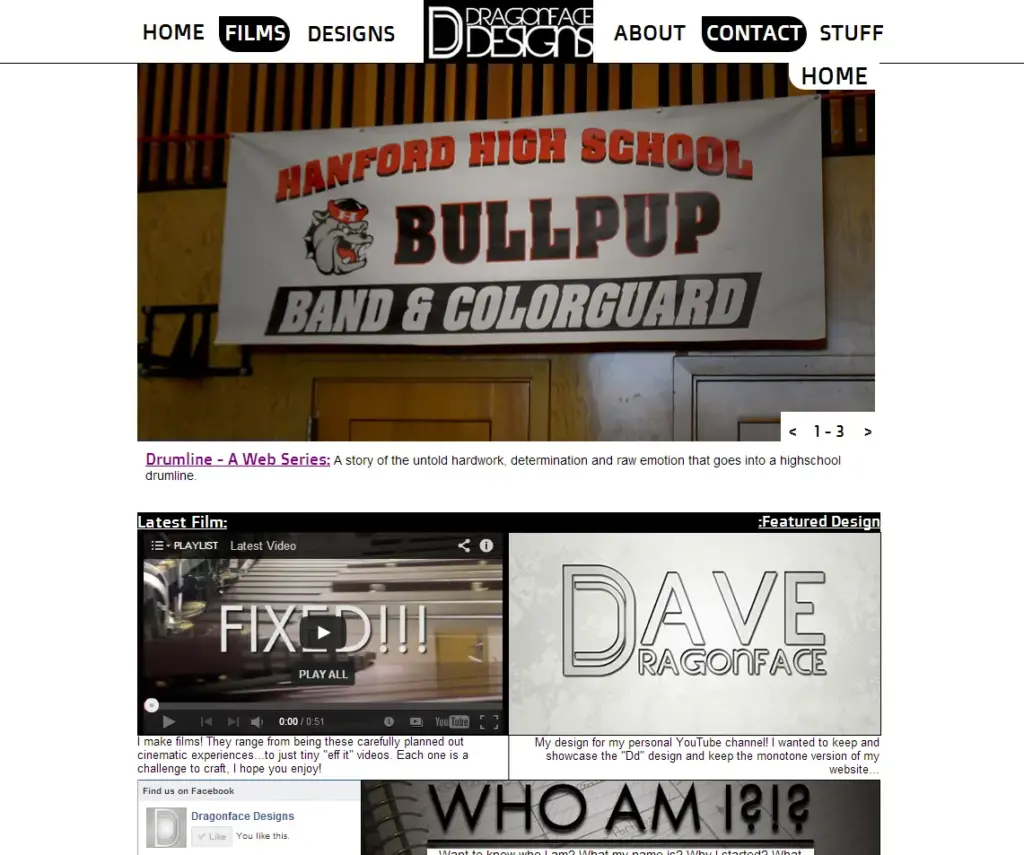
Long ago, in an era between the release of CS6 and the switch to Creative Cloud, there existed a creative application called Adobe Muse. It looked like an amalgamation between Photoshop and InDesign, but its superpower was the ability to convert whatever you had in the viewer into a fully functional website. For a young Dave back in California, this would become the face of a blossoming production studio. Any studio worth its salt needed a website to showcase its (at the time, non-existent) projects, and thus www.dragonfacedesigns.com was born. Dragonface Designs would be the design and commercial branch of my larger studio, which only consisted of my gaming YouTube channel, Dragonface Gaming. They would be united by a shared aesthetic, which high school me decided would be… paint splatter? Like seriously, I downloaded a single set of free paint splatter Photoshop brushes from the internet and decided that would be my look for the next four years. Nobody told me to stop, somebody really should have told me to stop. My current branding of blue with white and black makes more sense now: it’s penance for my prior crimes against color. And so, after watching half a tutorial with zero knowledge of web design and paint splatter brushes in hand – the first website was forged and unleashed upon the world.
v2 – Adobe Portfolio (Late High School)
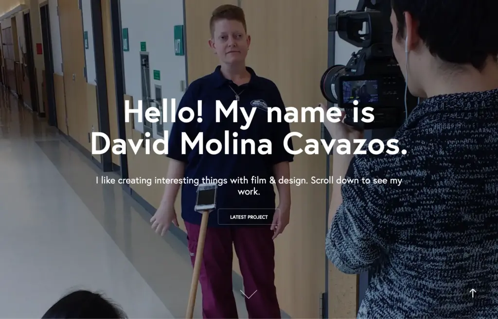
But v1 was not destined to remain for a long time. During my sophomore year, my school district decided it was time to at least be within spitting distance of technology in this decade. We were all given fancy new school email addresses and worked with Chromebooks a lot more than before. With my new school email, I was able to get a discount on the brand new Creative Cloud subscription service. The Adobe overlords decided that Adobe Muse was to go the way of the dodo and, as recompense, unveiled Adobe Portfolio. Portfolio would take your Behance account and all your projects (you knew about Behance before this, right?) and turn them into a beautiful, modern, responsive website. Easy, breezy, beautiful, Adobe Portfolio.
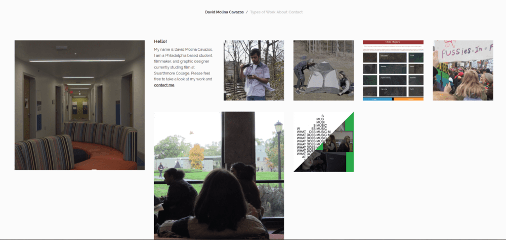
V2 laid the visual foundation for what I wanted from my online portfolio. My future customer would first be presented with a full-screen image that contained some basic information. They would then scroll down to see a grid of labeled photos, each representing a project. Selecting any of them would open another page containing the project. This subpage would display the project itself, an in-depth explanation of my role, maybe some work in progress images, and the credits. It was an incredible portfolio, but the biggest drawback of this version is that it was a crummy website. Customization was limited, and Adobe only had four-ish templates when it first launched. Want extra functionality like a blog? Sucks to be you, man. Have fun adding a link to another service in the nav bar, that’s the best you had.
v3 – Tumblr (College)
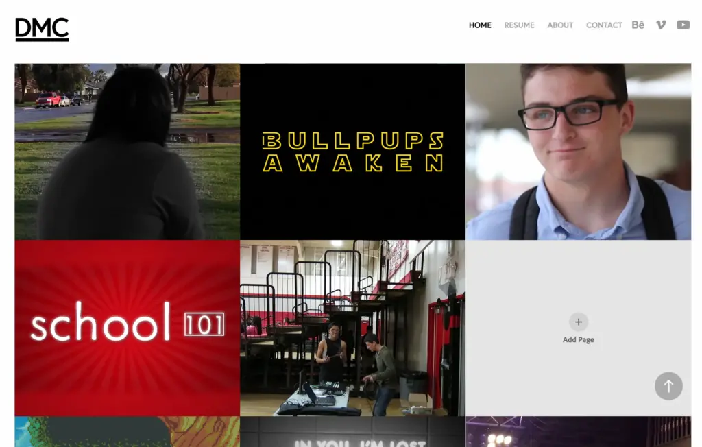
Alas, the Adobe Portfolio was also destined for the giant recycle bin in the sky. Going to college across the country was expensive, and I already lived at the Adobe-equipped Swarthmore College Media Center (the most magical computer lab place in the world), I didn’t see the need for my own personal Adobe subscription. An adult decision, one that cost me my beloved portfolio website and access to Premiere on my computers. So, what was a broke college student to do? The obvious answer was to just make something in Squarespace or Wix and stay on the free plan, but there was a huge problem with that route. The thought of having a subdomain like dmc.squarespace.com or dmc.wix.com seemed unprofessional, unacceptable, even unfathomable to me. This was a silly crusade that I would eventually give up on, but that’s a story for a future paragraph. The only service that I could find that would let me use my own domain, www.davidmolinacavazos.com, for free was Tumblr, so the solution was simple: time to absolutely butcher a custom Tumblr theme.
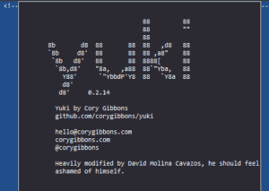
After a fair amount of searching, I found a minimalist photography Tumblr theme called Yuki. That theme would create the grid of images I wanted on the homepage, the project name/description labels becoming casualties in this battle against subdomains. But that was a tiny problem when compared to just how obviously a Tumblr theme this Tumblr theme was. The project and case study info only occupied half the screen on the individual pages, the rest taken up by reblog and notes counters. A fun aesthetic choice for a Tumblr blog, but a mortal blow for what is supposed to be a professional portfolio website. A more reasonable person would have just called it off here, labeled the bad idea as bad, and moved on to something else. I instead doubled down. I spent the next week or so systematically going through Yuki’s code and removing anything that was even remotely close to being Tumblr-y. The div containing the notes and reblog counter? Gone. The “follow this Tumblr” prompt on the homepage? Exterminated. The fonts and other design choices made by the developer? Awkwardly replaced with my own. What remained was an amalgamation of Tumblr blog and portfolio, containing only the worst parts of the two. But I was a genius, why deal with student plans that would leave me with a site I couldn’t afford in a couple of years? This free solution would last forever.
v4 Framer – (College Grad)
Years passed, a pandemic occurred, and some portfolios that should have been lost remained longer than they should. History became legend. Legend became myth. And I became a college graduate who was working as a professional in the commercial broadcast space. I was working on a fun combo of assistant editor, editorial, and live production work and needed a place to display all of them. It could have just been a simple portfolio, but a deeper hunger stirred within. I had unfinished business with this ongoing project of mine. A couple of years ago, I took the ol’ Tumblr website out behind the barn and put the poor thing down. My current solution of keeping my Behance portfolio updated was not enough. Sure, it displayed my work, but I wanted to create a home for myself on the web. It wasn’t just about showcasing my work; it was about creating something that would express my aesthetic and would grow and mature with me. It was time to make things right. This mentality caused the scope of the project to skyrocket, it was now a complete visual rebranding, not just a new portfolio.
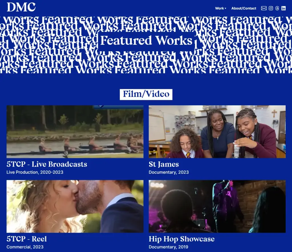
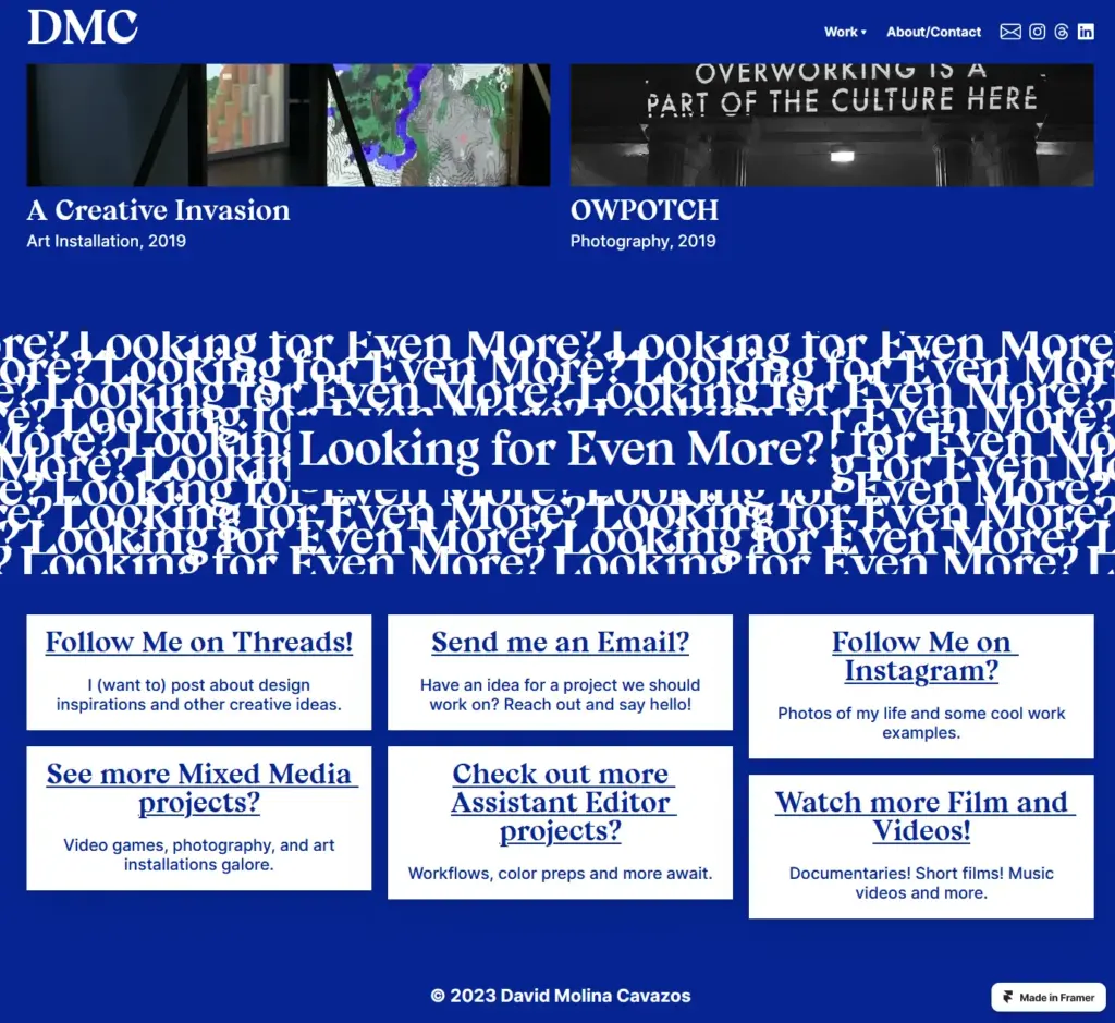
I’m saving a deep dive into the inspiration and process behind this redesign for another post later on, but the entire endeavor took around six months. I had built the new website in this lovely tool called Framer. It looked like an amalgamation between Photoshop and InDesign, but its superpower was the ability to convert what was in the preview window into a live webs – hey, wait a minute, we’re just back at Adobe Muse! Or something new that is an analogue of it. In spirit we’re back at the tool that started it all, now accompanied by 8 years of graphic and web design experience. v4 beautifully showcased all my work, my obsession with bold typography, and my unironic love of the neo-brutalism trend. I tried to quiet the whispers that reminded me about the fact that the plan was quite expensive and I had “launched” it under a dmc.framer.com subdomain. No, nope, nuh-uh. It was perfect and finally my project was over. A poetic full circle. Nothing to ponder any longer. I can be happy now. Ironic, isn’t it, that the best website so far had the shortest shelf life of them all? It only lasted two months before I pulled the plug.
v5 – Venti, WordPress, and (the Future)
I have already written about my semi-ethical concerns with my Framer website in-depth before, so I won’t go into too much detail here. In a nutshell, I wanted more control over the future of this website than Framer as a business could offer. For something this genuinely personal, I wanted more control over the tools I used to build it. As a result, I made a massive switch. I veered away from the walled gardens of private business to the accessible flowing rivers that are free and open source software — I just made another WordPress blog. Welcome to v5 – Venti. I loved the aesthetic and layout of v4, so I largely kept all of that intact. But now, the whole thing is built upon a foundation I have significantly more control over. Finally, actually, for real this time, not a cap in sight; the quest is over. v5 – Venti is affordable, easy to maintain, and will be a living document that will grow with me. I’ve taken that last point to heart. Since launching a month ago I have: changed SEO plugins three times, completely redesigned multiple pages, and even restructured the entire website. That’s a large part of the charm for me, it’s a train I’m building as it’s rolling down the tracks. Trial by fire is how I learn best, I’m home at last. Thank you for making it this far, stay safe out there my friends.