The Great Note-taking Odyssey
A meme sent me on a months-long quest to find the perfect replacement for Apple Notes. Instead of solutions, I only found madness.
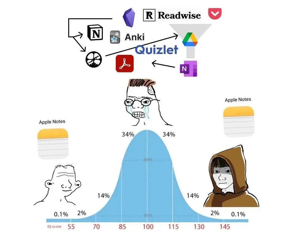

The meme has been haunting my every waking step for the past five years. It’s an infohazard, one that infiltrated my YouTube feed as a thumbnail and doomed me to this eternal torment. It’s a simple image: it shows a standard deviation curve with an individual’s IQ on the X-axis. Both the smartest and dumbest people on either end of the curve are happily using Apple Notes as their notes app of choice. Everyone in the middle is caught in this miserable web of despair, caught in a cycle of constantly switching between apps, comparing features, comparing prices, importing/exporting entire folders of notes, and existing in a constant state of suffering while doing so. You can imagine what camp I was in when the meme kicked down my door, convinced my wife and child to hate me, and ruined my life. I’m only slightly exaggerating there, at least I don’t think I have a wife and child? But I felt so unbelievably called out that I radically altered the way I worked for five years because of it. Back then, I decided that I would show the meme who’s the boss. I put my foot down, stopped the despair cycle, and migrated to Apple Notes. But, why Apple Notes? What’s all the fuss about such an innocuous app?
Apple Notes
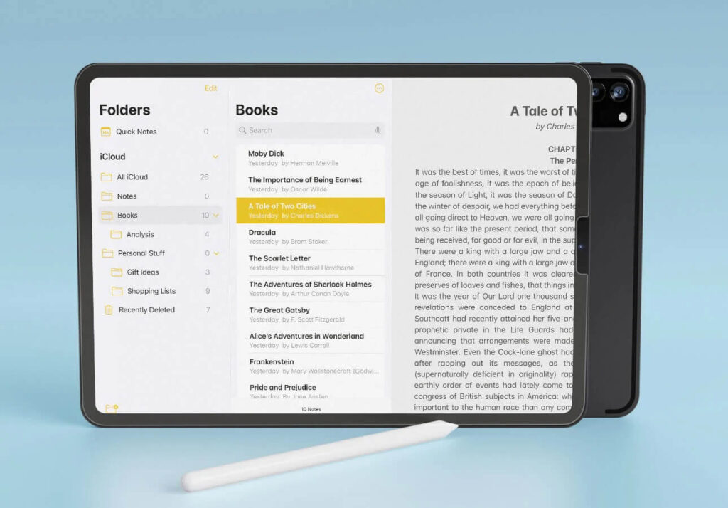
Apple Notes is the subject of the meme’s adoration because it will get 90% of people 90% of the way there. It’s The Miz of note-taking apps: dependable, consistent, but not exciting or much to write home about. It’s a surprisingly capable and feature-rich note-taking app for something that comes preinstalled on every iPhone in the world. Apple Notes can: organize through tags, organize through folders, connect notes via backlinks, sync across many devices, and it is free and already installed on your phone. Be honest with me, what more do you really need? (If you are on Apple devices, sorry Android friends)
Well for me, Apple Notes’ Achilles’ heel was the sorry state of its Windows support. Apple does not make a native notes app for Windows, instead their solution is for you to access your notes through the iCloud Web Portal. It’s…not great. It arguably works, but there’s a litany of small issues that make using it as my daily driver a constant pain. The web interface has this great habit of randomly logging me out, requiring me to scramble for my iPhone when I’m trying to quickly jot something down. The keyboard shortcuts are also backwards on Windows. Even though I’m on a PC, the web app expects a Mac-style keyboard where the alt/control keys are backwards. This results in a constant dance of getting a shortcut wrong, having to remember why it’s not working, mentally flip the control/alt keys, type the shortcut the special way this ONE website requires, then repeat the process for the next line. Why doesn’t it just work natively with Windows shortcuts? If I was already on a Mac, why wouldn’t I just use the native app?! I’m already logged in! These are two specific complaints of many, but the experience as a whole is a death by a thousand paper cuts. It’s hard to ignore the temptation to find something better when I feel these pain points every day, on every line, of every note. The final twist of the knife is knowing how green the grass is on the other side.
TLDR: A damn good notes app. Feature-rich and very capable, but the web-app is awful. Pre-installed on Apple Devices, free.
Bear

Bear is the gold standard of note-taking apps. It’s Hart, Michaels, Omega, and the Bucks all rolled into one. I discovered Bear when I was in college and I was initially drawn to the app for its aesthetic. Bear has my style of thoughtful minimalism that feels like it gets out of my way when I’m writing. It pairs perfectly with my Mac and iPhone, giving real ✨writing-a-memoir-in-a-coffee-shop✨ and I’m all for that. The app feels premium, the simple act of booting it up and swiping around feels incredible. From that user-experience perspective it towers over the rest of the pack. But my adoration of Bear comes not only from its design, but the impactful note-taking features that come alongside its slick visuals.
First, is the transcendent power of tagging as a way to organize your notes. Bear makes organizing as simple as writing # and then writing a category. Back then all my class notes went into #School, my creative endeavors (like this blog post) into #Creative, and all my other nonsense fell into #Personal. Add in sub-categories and baby, you got yourself organized chaos without your hands ever leaving the keyboard. When I wanted to add a new set of class notes I would just type #WorldCinema and Bear would auto-fill that to #School/Spring2019/WorldCinema. That note is now organized and my hands never left the keyboard. The act of organizing did not impact the writing experience at all, in fact it’s included in that process. Other apps would require me to take my hands off the keyboard, move one to the trackpad, click to open the sidebar, click to open the “School” folder, click to open the “Spring 2019” sub-folder, then click and drag my new note into the final “World Cinema” sub-folder. All those extra steps are excruciating when I know this process can be much, much faster.
Second, is the might of markdown. I use headings and subheadings as a way to visually organize my notes. The ideas are chaotic and messy and the act of wrangling those suckers into categories is part of my creative process. It helps me turn chaos into something I can present to other people. As you can guess, Bear makes this a breeze. Bear uses a system called markdown to format your notes. Markdown is a (semi-)universal way of formatting text in documents so other apps can interpret them correctly. To create a level two subheading, all I have to do is write ## Subheading Two and boom, there it is formatted correctly. No need to remember more keyboard shortcuts, fiddle with sub-menus on mobile, or take your hands off the keyboard to select an icon. This extends to bullet points, check lists, and other formatting options like italics. Yet another core feature that speeds me up every day, on every note. Markdown is also a common standard in writing apps, meaning that it is easy for me to export my notes from Bear and import them to other apps or turn them into a WordPress post. Bear is not a walled garden, I can check in anytime I like and I can also leave.
TLDR: Beautiful design, powerful tagging/organizational features, markdown support is the best. $30 a year.
So Why Don’t You Just Use Bear?
Yeah, about that. The big problem is that now we’ve gone from crummy Windows support in Apple Notes to no support at all in Bear. It is MacOS and iOS exclusive. Bear was great in college when I was mostly writing papers and using my laptop. Now that I’m working on more involved creative projects that require my Windows desktop, I cannot only have my notes on my Mac/iPhone. There IS a web app coming in the future, but coming soon does not resolve my need for a note-taking app now, thus the cycle described by the meme and my eventual shift to Apple Notes. And there I was, in Apple Notes, plodding along and wincing every time Apple Notes would crash and log me out or scramble my keyboard shortcuts. Finally around the beginning of this year I had enough, it crashed one time too many. It was time for me to ignore all the voices in my head telling me this journey would be a waste of my time and find a better solution. It was time for me to pack up and explore the big world of note-taking apps. There had to be a solution to my problem. The meme smiled in return.
TLDR Addendum: Heartbreakingly, Bear is Mac and iOS only.
Simplenote
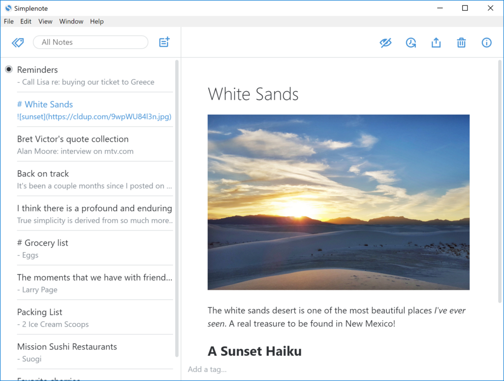
First up, is Simplenote. Simplenote is exactly what it says on the tin – a simple, easy, and free note-taking service from the team at Automattic (who I have had a bit of a crush on). It can make new notes, format them with markdown, organize via tags, and not much else. That’s it. No fancy themes, collaboration, web clipper, or any expectations to become the organizational center of your life. It presents a blank page and you fill it with nonsense. It’s simply…notes. I thought I would adore the simplicity of it, but Simplenote taught me the difference between an app having markdown support and being a markdown editor.
Simplenote is a markdown editor, meaning you can use the usual symbols (#, *, _, etc) to stylize your notes but the app won’t display those changes as you’re writing. Typing ## Heading One won’t magically make that text a heading with a bigger font size. I will just see ## Heading One in my note, pound signs and all. Rather than automatically formatting them like Bear, there’s a toggle at the top of the page that lets you switch from the raw markdown to the final presentation. Ah finally, my note looks the way I want it to! All the symbols are gone and the fonts are the proper size. Weird that’s an option tucked away in the corner but now I can go back to writi- oh. Unbeknownst to me, a long buried monkey’s paw curled when I clicked that preview button. It is a visual preview only, once you are in this preview mode you can no longer edit the text. What?! Why would anyone not want to visually preview what they are writing? Why would I not want to benefit from the formatting while I’m writing, what I will be doing most of the time I have that note open?! I’m assuming this is how markdown editors worked in the past, but we’ve seen the light and this is simply not it.
TLDR: Fully cross-platform, less formatting and organizational features than other apps, ancient approach to markdown. Completely free, subscriptions are viewed as donations (for the moment).
Evernote
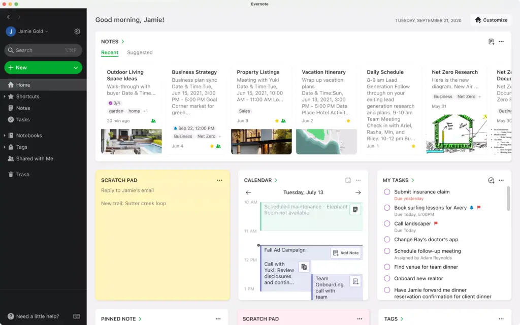
Oh, fuck no. Look, Evernote used to be note-taking royalty but it’s been a minute since it had the crown. Back in the day, its killer feature was the ability to sync your notes across all your devices. That was revolutionary back then, but almost every app on the market does that now – many for free. So how does Evernote pitch its drastically increased prices? A slew of productivity and team management features. Tasks, calendars, chat, image character recognition when you scan documents – all features that I will never use. I’m just trying to write down this post and screenshot my Counter-Strike 2 smoke lineups, I don’t need the ability to tag others in tasks to do so. This feature bloat is complimented with shockingly rancid vibes surrounding the app. Between the aforementioned price increase, acquisition of Evernote to another company, and the predictable shuttering of the original team, it feels like the app is on death’s door. Evernote discourse isn’t just posts of people migrating to other apps, it’s posts complaining about the amount of posts of people migrating to other apps. So many people are asking for advice on how to get their stuff out of Evernote that it has hampered discussion about the app itself. It looks like the new team is making good updates, but why jump on a sinking ship?
TDLR: Fully cross-platform, rancid vibes, cluttered note-taking due to productivity suite features. $130 a year – wait, what?
$130 a year? Are they nuts?! For $130 a year I’d be able to purchase Microsoft 365 which includes:
- The industry standard productivity suite (Word, Excel, Powerpoint, etc)
- 6TB of cloud storage
- Another note-taking app in OneNote
- Full backups for all my devices
- The ability to share all those features with six people
- AND I’d still be able to purchase a year of Bear for myself (and my iCloud family!) with the remaining $30
I don’t even get the emotional benefit of feeling like I’m supporting a small company because, again, the entire original team was acquired then fired by a larger company. This isn’t even the most expensive plan, $130 a year is the starter plan with limited features! Yikes, yikes all around. Yikes as far as the eyes can see. Yikes.
ADDENDUM TO TDLR: $130 a year, laughably expensive. Don’t buy this nonsense.
OneNote
Speaking of, what is Microsoft’s foray into the note-taking space? OneNote stands out from the rest of the apps listed here because it’s less of a normal note-taking app and more of a digital notebook. It doesn’t work in the Word/Google Docs format where there’s one infinite textbox that you break apart with headings and page breaks. OneNote is a lot more free-form. You can create many textboxes of any shape and size and move them around as you please. There are also a lot of brushes and drawing tools that you can use if your device is compatible with a stylus. It’s powerful if you dislike the rigidity of text documents and want more of a mind mapping experience. I certainly do not and this flexibility drives me up the wall. Now I have to manually go in and ensure each textbox is the same size and is lined up. I’m trying to find ways to wrangle my neurosis, not exacerbate it Microsoft. OneNote does not contain markdown support or tagging (it only works with folders) and the entire app feels like it’s built around a stylus my MacBook does not have. But I was on an iPad (or heaven forbid a Surface) and knew how to draw, I could see this being a contender. But also Apple Notes (and Bear!) has drawing support, so the meme strikes yet again.
TDLR: Fully cross-platform, stylus-oriented interface, more of a digital notebook than a text editor. Free.
Notion
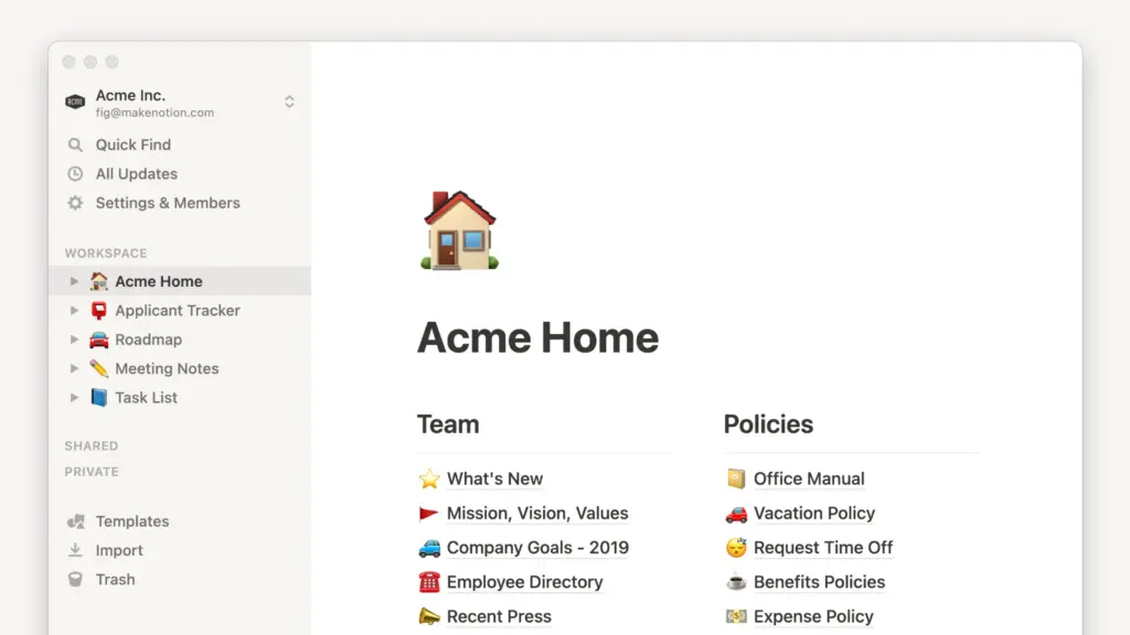
Ladies, gentlemen, and all friends in-between – we are entering main event territory. Out of all the apps out there, I was the most excited to try Notion. I had spent years passively sipping on the Notion kool aid. I listened to countless academics, journalists, and content creators extol the virtues of a proper Notion set-up. Notion had supposedly helped writers pitch their stories, kept chaotic small businesses organized, and managed countless digital lives. Notion was more than an app, the internet told me, it was a second brain. An extension of a person’s being, the culmination of all their notes and saved articles that were bookmarked but will never be read. I was thrilled to finally join their ranks and bring order to my digital life – order I didn’t even know I was missing. The meme may have haunted me in the past, but I was about to have the last laugh. With these emotions in mind, stop for a second and imagine the look on my face when I came to the realization that Notion is not a note-taking app at all. And I have no idea why people bring it up all the time when others are asking for recommendations.
Alright then wise guy, if Notion isn’t a note-taking app then what is it? Notion differs from the other apps listed above since it has grander ambitions than solely being a note-taking app. Notion is a team-oriented knowledge management tool. That word spaghetti is a purposefully vague and semi-useless definition because I’m not sure how else to describe a tool whose main focus is flexibility. This focus on flexibility begins with Notion’s foundation – how it handles any information. Any text, image, link, or whatever added into Notion becomes a “block” which I can drag and rearrange. Notes then, are just a combination of blocks and they do not have a strict layout. I can visually separate these blocks by adding columns, drop-down menus, and other forms of dividers in the note. The combo of this block approach and layout flexibility results in using Notion feeling less like writing a document and more like designing a website. Not only do you have to fill the void with your ideas, you need to design how they will be displayed.
So far, Notion sounds like a fancy document editor. The “knowledge management” vs “note-taking” difference is due to how many options you have to link notes inside of other notes. Notes can be nested within other notes, turning the parent note into a note-folder hybrid. You can create a spreadsheet style database where each row becomes a new note, the columns turning into properties that you can customize and color code. Notes can be referenced inside of other notes through text links and even live previews of blocks can be embedded into notes. Pair the previously discussed visual flexibility with these linking features, and it’s easy to see how Notion has the potential to become the wiki of your life. But potential is not a certainty, and it’s important to note that Notion will not automatically do any of these things for you. For example, the database column properties feature replaces the tags method in other apps. You cannot tag notes placed outside of a database; tags are now something that you will have to discover and implement yourself. Notion is not the perfect framework to organize your digital life; Notion is the perfect framework to create the perfect framework to organize your digital life.
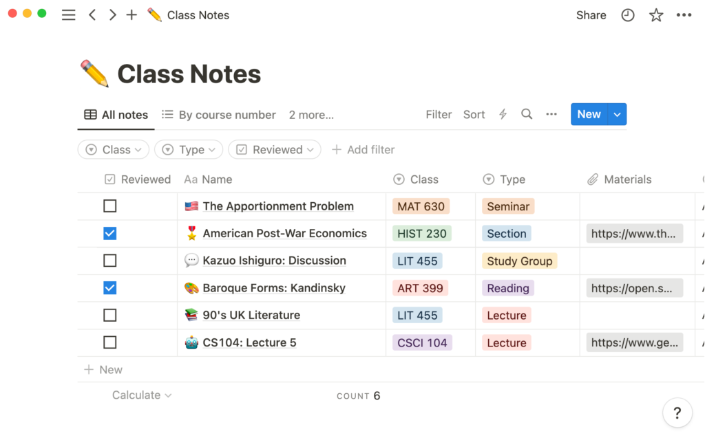
I think this distinction became the dealbreaker for me with Notion, it does not come out of the box ready to organize anything. There are countless blocks and database features, but no guidance on how to use them. Should my notes be nested or live in a database? What’s the best way to visually preview either option? What are the pros or cons of either approach? These are all fundamental questions that Notion does not answer and leaves for you to discover. Notion is note-taking with all assembly required: exploring all the organizational possibilities is as much of the experience as actually writing. Sure, there is a massive library of pre-made templates but finding one that does everything I need it to is no small feat. Plus there’s the added labor of going into that template and removing those pre-made categories and replacing them with my own. To be fair, Notion’s organizational approach is not without merit! All these features can lead to novel set-ups. You can create a dashboard with live previews to sub-notes, giving you the most recent information at a glance. If you take a peek at the subreddit, you can see how customizable the aesthetics can be! You can even…wait, do you hear that? That sound? It’s the meme, it’s laughing at us, and it has a point. The Notion way is endlessly tinkering with it in a endless quest to create the perfect set-up. But isn’t that time better spent…working on the project you were trying to organize to begin with? Isn’t wasting time the very thing I’m trying to avoid with this app? Notion has its very own smaller version of the meme’s pain cycle – but it’s not a loop, it’s a spiral. One I’m going to avoid altogether.
TLDR: Fully cross platform, great community, arguably too flexible for its own good. Not a note-taking app, more of a knowledge management system. Generous free tier, you’ll only need to upgrade if you become deep in the Notion ecosystem.
Obsidian
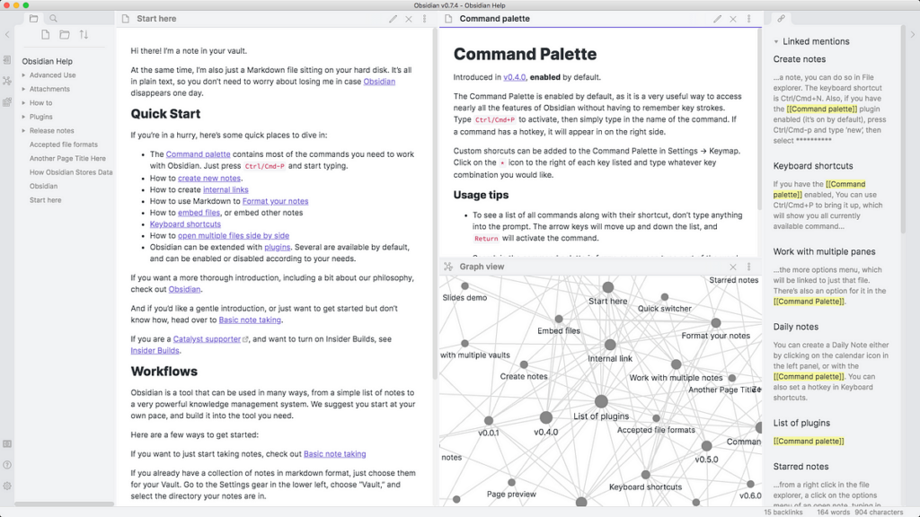
Not becoming a Notion zealot broke my heart. I had spent years feeling like Tiny Tim, watching others feast through the window while I sat in the cold streets of Apple Notes. A part of me felt guilty that, after all this pining, I felt nothing but apathy rather than the Christmas spirit when I was finally let in. The Christmas spirit in this case is…an organized set of notes? Whatever, you get my drift. Thankfully, I had the perfect remedy for my wounded heart – yet another trendy note-taking app, Obsidian. On paper, it should be perfect for me. Obsidian focuses on text over media, includes cross-platform capabilities, is fully open-source, has a compelling file-over-app philosophy, and offers extensive customization through community plugins. But as Notion showed, theoretics do not always translate to reality and Obsidian is another example of that.
Obsidian never clicked for me. It’s simply not set-up the way I would like it to be, starting with the fact that tags are second class citizens there. The renowned graph view ignores them entirely and there’s no good way to sort through your notes in a tag. Selecting a tag does not create a slick menu with all the included notes; instead, you get a broken search with the tag endlessly repeating as the text preview (see image below). Tags are also tucked away to the side in the UI, hidden in the right sidebar. It’s obvious Obsidian’s organizational focus is on the traditional file/folder structure and the in-text backlinking system. I’ve already tried both of those in Notion, was not convinced there, and Obsidian’s implementation did not change my mind on it either. It’s a fine enough system, but it doesn’t bring enough value to me to make the added tedium worth it. Especially when I already know tags are easier and provide more than enough structure for me.

The observant among you can likely guess Obsidian’s answer to my set of whinges – it’s endlessly customizable and has a massive library of community plugins. There’s a popular plugin that replaces that file-folder sidebar with a new one generated from tags. Another gives me greater controls of tags, letting me merge and split them at will. A third lets me hide all of the Obsidian features I do not want to use, like the backlinks and graph views. It’s great that I could do this, Obsidian gives me way more control than any other app I’ve listed before. I even followed this nifty guide to make Obsidian feel more like Bear – but the end result did not convince me. These plugins always felt like hacks rather than intentional design decisions. Sure I can add the TagFolder sidebar, but clicking on a tag will still bring up Obsidian’s broken search rather than the new TagFolder menu. I’m sure there’s an option to change that somewhere, but having to do that is part of my problem. I don’t want to dig through multiple sub-menus and experiment with options to make the app feel good, I just want to write. I can sense the meme making its way towards me as I explain this. On top of that, I’m going to spend even more time syncing all those plugins and options across all my devices. Then I have to figure out how the heck this is supposed to translate to the iOS app? Absolutely not, that doesn’t work for me, brother. It’s a bummer, because I adore Obsidian’s mission statement. So far, it’s my highest recommendation for a cross-platform strictly notes app, I just hope you’re not as picky as I am.
TLDR: Cross platform, open-source, powerful organizational features, (too) customizable, and fantastic morals to boot. Bummer it wasn’t for me. Completely free if you don’t mind syncing files yourselves, plans start at $5 a month otherwise which is a steal considering the alternatives.
UpNote

If I had a lick of sense I’d use UpNote and be done with it. On a functional level, it’s perfect. It has both tags and folders (or “notebooks” as the app calls them), but you can use or ignore either option. Markdown functions just how I like it, with live formatting but the formatting characters are hidden while I’m writing. It’s fully cross platform and even has the ability to generate web pages from my notes, so I can easily share them with others. It’s offline first with the ability to quickly create local backups and restore them. All of the notes are just markdown files, so it was a breeze to import my previous Bear/Notion/Obsidian library (and export it to another app when I inevitably flake). It matches, dare I say surpasses, the functionality of Bear for a fraction of the cost. All of this is SOMEHOW only $1 a month or a one time payment of $30 for a lifetime subscription. Those prices aren’t just a deal, they’re highway robbery. Thinking about buying that lifetime subscription makes me feel like I’m actively removing funds from the developer’s kid’s college fund. It’s everything I want, so what the fuck is my problem and why aren’t I using it?
Frankly I’m baffled that this still isn’t enough for me, but some introspection has led me to three points. First, the app is missing some design je ne sais quoi. Bear is a gorgeous and thoughtfully designed note-taking app, it undeniably has a vibe. Sure, the vibe is ✨pretentious-coffee-shop✨, but it’s something I feel every time I boot up the app and start writing. Notion is a thoughtfully designed knowledge management app, it also has a vibe. Sure, it’s ✨Helvetica-used-in-the-signage-for-the-NY-Metro✨, but it’s something I feel every time I open the app. UpNote’s design is missing that next step for me. The step where it goes beyond functionality and just the act of swiping around the app feels satisfying. This is a silly argument and goes beyond a nitpick, but it’s one my little graphic-design-is-my-passion heart feels strongly. To be fair, UpNote is by no means a bad looking or ugly app. But it’s hard to go back from the top-tier design of the other apps.
Second, I’ve been tainted by Notion and Obsidian’s promises of personal knowledge management. I’ve seen the light and I now want the cool-looking graphs with all my notes. What if they had a point and there’s something even better than my beloved tags? Is there any substance behind the claim that a more free-form, web-like style of organizing my notes is better than just placing them in strict hierarchies? Now that the answer has been put in my head…I have to know. Third, and most importantly, I’m sick and hate being at peace. I am one with the cycle now, I have become the very thing I tried to avoid. There is only the meme’s cycle, I know no other way.
TLDR: Get this one. Tagging support, cross platform, offline-first, the list goes on. $1 a month, it’s the cheapest paid option on the list while offering just as many note-taking features.
So Now What?
It’s been a long couple of months, but I have successfully mapped out much of the note-taking landscape. I have searched high and low, from indie to mainstream, and so many in-between. Where did I finally land? What was my ultimate conclusion? Well, I’m starting to realize that I’m in a worse spot than I was before. I tried many of the most talked about note-taking apps and couldn’t mesh with any of them. They either had too much customization and felt like janky apps I created in another app; or, they didn’t have all the features I wanted implemented in the way I needed. To further twist the knife, when I finally found the perfect one I realized that the goal posts have moved. It’s no longer about finding a Bear alternative with Windows support, I found that with UpNote. I’m intrigued by the promises of a PKM-style app and I want to see what all the fuss is about. The meme has been playing the long game and I fell right into its trap.
While frustrating, this realization at least provides a path forward for me. I’ve been looking in the wrong place this whole time. Instead of trying traditional note-taking apps, maybe I should be looking at apps more like Anytype or Capacities? That is, of course, foreshadowing for a future post. I’ll report back once all that dust settles. Thank you for making it this far, stay safe out there my friends.
And to Bear, my beloved, I love you. You will never leave my heart. But the world has changed, and I have changed with it. I love you…so I have to let you go.